The aGooey UI toolkit
Every graphic SND draws — knobs, faders, meters, LEDs, tactile keys, menus, modal dialogs, graph nodes, a keyboard, an XY pad, a step grid, a sequencer matrix — rendered here from the same shared paint vocabulary that powers snd::ui::retained, Dear ImGui compatibility, and the renderer-neutral draw::Surface path.
Knobs
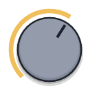
paint::drawKnob · KnobStyleSeven hardware-oriented styles. Ring / Seq — the sequencer ring (Seq has flat, square-capped ends and no thumb dot). Synth — flat dished disc + track ring + value arc + pointer tick. Davies — moulded cap with a full tick ring. Scalloped (Nxd) — a scalloped case that rotates with the value, with a tick ring and bold pointer. Cap — a matte cap inside the value arc: flat, one soft shadow, no hover. Halo — a light metal skirt round a dark face, with the pointer and a glowing value ring lit in the accent; it shares Cap's outline, so one swaps for the other.


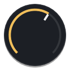
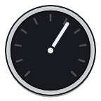
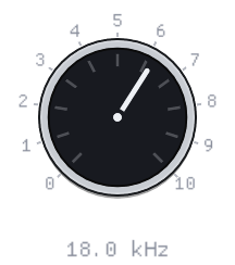
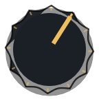

Knob modulation ring
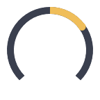
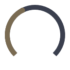
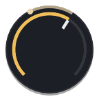
paint::drawKnobModRing · KnobModA second thin arc shows modulation depth from the value; the dot is the live modulated position. SND draws the overlay after any body — built-in styles or custom painters — then the focus ring, so modulated knobs keep one shared look.
Randomise window
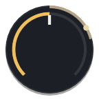
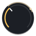
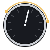
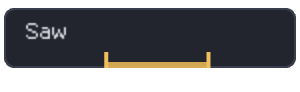
paint::drawKnobWindow · drawComboWindow · KnobWindowRandomise fences: every control carries an independent {lo, hi, locked} window — an arc with two separately grabbable end dots over knobs, an index bracket under combos, and a padlock in the middle of the knob when it is locked out of RND. Draw + hit-test live in SND; the overlay mode and drag state stay with the caller.

Fader
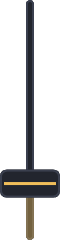
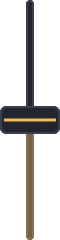
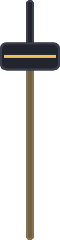
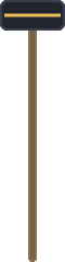
paint::drawFaderTwo styles. Slim — the house strip: a centre rail, accent fill below a small cap, the cap brightening while grabbed. Channel — a square groove with a deep thumb the full width of the slot, for a mixer strip. Alt-click puts a fader back at the value its binding names.


Toggle
paint::drawToggleSliding switch; the track lerps to the accent as the nub travels.


Stock faces
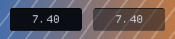
paint::lampFace · ledFace · fieldFace · IconButtonFaceThree kinds of control that should not look alike, each a ready-made face for an outline button or a dropdown. Lamp — a toggle as a lamp: a dark disc with a glyph in it, and lit, only the glyph and a thin ring take the colour; it can show a second glyph while lit. It is the house icon button by default; the same button can be asked for as a square key instead, in the outline chrome of the text buttons beside it, filled while selected (IconButtonFace::Square). LED — a latching button as a cap with a small lamp beside its word; the cap never changes, so the word reads the same either way. Field — a value, not a button: a field sunk into the panel. With SND's chevron on top it is the house dropdown, and its fill can be thinned so a panel's artwork shows through.


Transport buttons
widgets::transportButton · paint::drawTransportGlyphThe building block of a transport bar: the outline-button chrome with a crisp vector transport glyph (drawn, not a font), picked by intent (Icon::Record, Play, Stop, Loop). The engaged fill marks the state — blue for play/cycle, and record goes red, its ring filling to a disc while armed. Fires on mouse-down for no-latency feel.
Segmented
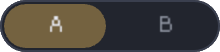
snd::ui::segmented · paint::drawSegmentedA pill group of mutually exclusive options — mono/stereo, filter slope, A/B. One selection; Left/Right arrows move it when focused; equal-width segments sized to the widest label.


Glyph strip
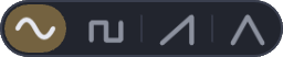
snd::ui::glyphStrip · paint::drawGlyphStripSegmented with vector glyph keys instead of text — the synth oscillator-wave and LFO-shape selectors. Same binding and interaction as segmented; the speaker key is a plain transport toggle for the LFO audio-rate switch.


LED switch
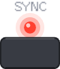
snd::ui::ledSwitch · paint::drawLedSwitchA hardware-style switch: a silkscreen label over a red lamp over a tactile key. The lamp carries the state — the key only shows the press. Mini and full are the same widget at different sizes.

Switch matrix
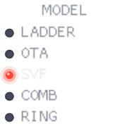
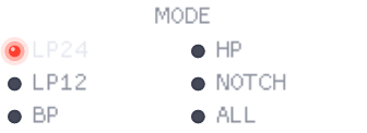
snd::ui::switchMatrix · paint::drawSwitchMatrixLabelled option columns (filter MODEL / MODE / POLES): every option printed with a mini lamp, the active one lit red, radio-select. One column up to five options, two above. The binding is the selected index, exactly segmented's.
Stepper
snd::ui::stepper · paint::drawStepperA nameplate [-] value [+] key pair (BEND, VOICES). Click a key or use Left/Right when focused; steps by the binding step and clamps to the range.

Cycle button
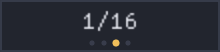
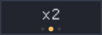
snd::ui::cycleButton · paint::drawCycleButtonA multi-state value button: click cycles the enum in place, right-click steps back — one control, no dropdown. Pips mark the position in the cycle, and the button is sized to the widest option so nothing jumps.
Animated & custom paint
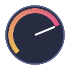
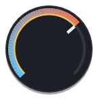
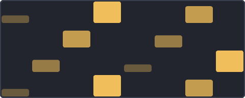
animatedButton · ButtonPainter · KnobPainter · FaderPainter · XYPadPainter · PatternCellPainterGeneration/action buttons can carry a subtle live sweep, while custom painter hooks let a consumer draw a knob, button, fader, XY-pad, or pattern-grid-cell body without owning hit-testing, focus, keyboard, value mapping, or accessibility. SND draws the required focus treatment after the painter runs. The gradient knob and velocity cells below also use the shared drawGradientArc / drawGradientRect primitives.
Tactile key
paint::drawTactileIconButtonThe other button family — a hardware key for icon & tool buttons (transport, momentary/toggle tools), not text. Light-grey raised, presses into a soft off-white inset with the glyph lit in the accent. Press one. Text buttons stay on the flat style above — tactile isn't every button.
LED button
snd::ui::ledButton · paint::drawLedButtonThe tactile key with an integrated status ring — record-arm, input monitor, transport latches. Latched buttons hold the inset face with the ring lit in the accent; arm pulses while pending.


LED
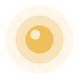
paint::drawLedStatus lamp with a soft bloom when lit.

Meter
paint::drawMeterPeak meter with the classic green / amber / red hardware zones and a peak-hold line. Vertical and horizontal.



Badge & section header
paint::drawBadge · drawSectionHeaderSmall labels: a tinted pill and a dim caption with a trailing rule.

Tooltip
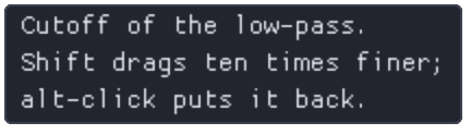
paint::drawTooltip · setTooltipWrapWidthA hover box in the palette's frame colours, placed down-right of the pointer and kept inside the window. Text wraps by words at a width the caller sets, and a newline breaks a line.
List item
paint::drawListItemSelectable row — the accent rail and tint mark the current selection while text stays aligned. Click a row.
Value row & drag number
paint::drawValueRow · dragNumberCompact readouts and horizontal drag values share the same value-row paint in immediate and retained modes. Drag numbers keep model state caller-owned; SND owns the row body, focus and fine-drag affordance.
Pattern grid
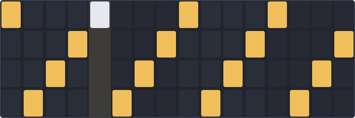
paint::drawPatternGridStep sequencer grid — lit cells in the accent, a checkered off-state on the beat.
XY pad
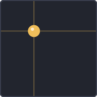
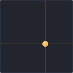
paint::drawXYPadTwo-axis control with a cross-hair and a lit handle.
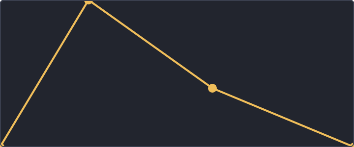
Envelope / Canvas
paint::drawEnvelope · retained CanvasBreakpoint curves use the shared envelope painter. In retained mode this is the shape of a Canvas-backed editor: the node owns layout, focus, hit and semantic space while custom drawing owns the pixels.
Keyboard
paint::drawKeyboardPlayable range — white and black keys light in the accent.

Sequencer matrix
MatrixGridGeometry · SequencerMatrix · GhostFenceRetained audio-editor primitives for sequencers and table editors: shared matrix geometry, continuous bars, gate cells, route cells, band spans, playhead, selections, drag preview, help labels, and pass-through ghost fences.
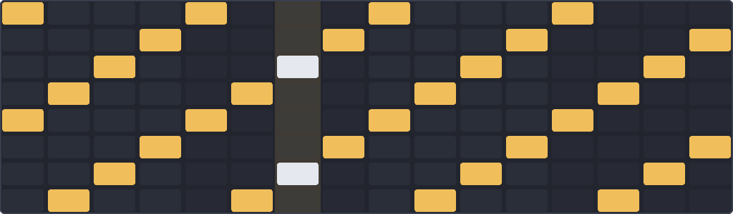
One object returns row, gutter, cell, and playhead rects for paint, hit-test, and semantics.
Continuous bars interpolate across skipped columns; gate and route rows drag-paint.
GhostFence, Help, Playhead, Selection, and DragPreview draw above rows without stealing input by default.
aGooey render surface
snd::ui::retained · draw::Surface · GlWindowaGooey is the retained UI path: stable nodes, layout, focus, events, dirty state, semantic snapshots, and renderer-neutral painting. The C++ namespace remains snd::ui::retained; the public drawing seam is snd::ui::draw::Surface.
GlWindow renders retained trees without a Dear ImGui context, through OpenGL or, on macOS, Metal. Plugin editors on macOS always draw through Metal.
Both backends multisample four times, and strokes and circles add a one-pixel soft edge of their own, so a thin ring stays smooth.
A window repaints when something changed, not on every frame.
Immediate compatibility and aGooey use the same palette, focus rings, icons, and control geometry.
RecordingSurface records operations for tests without pretending to be visual QA.
Controls publish roles, names, values, checked/disabled state, actions, and virtual children for spatial surfaces.
Modal dialogs
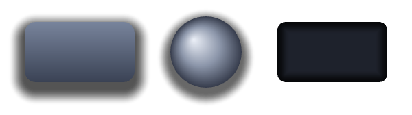
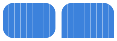
modalOverlay · modalDialog · alertDialog · confirmDialogRetained blocking overlays with dim, blank, or no visual backdrop, centred dialog chrome or custom panel content, real button children, Escape policy, Tab focus trap, inert background input, and Dialog/Alert semantics.
Delete module?
This removes the module and its cables. Background controls are inert until Cancel, Confirm, Escape, or the configured scrim policy resolves the dialog.
Graph surface
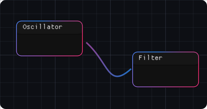
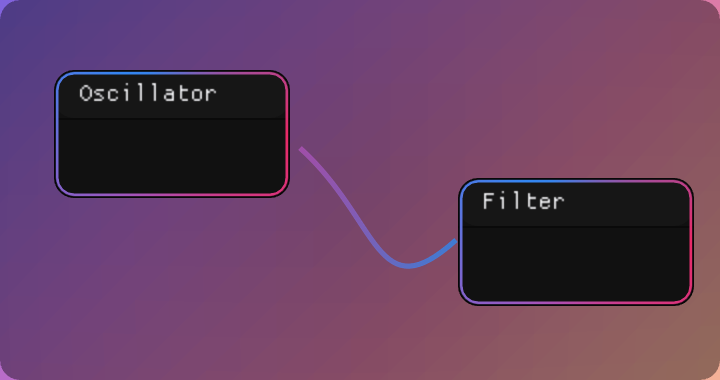
widgets::graphSurface · drawGraphGrid · drawCable · drawModuleBoxRetained graph surfaces own pan/zoom, grid/backdrop, selection, cables, module chrome, ports, hit regions, anchored context menus, keyboard traversal, and virtual semantic children. The caller owns graph data and mutations.
Text field & value field
widgets::textField · widgets::valueFieldRetained text editing on a caller-owned string. Click to place the caret, drag to select, double-click a word, triple-click the line; Shift with the arrows, Home or End extends the selection; select-all, cut, copy and paste go through the system clipboard, in an app window and a plugin editor alike. A field that has been clicked into shows its caret, its selection and a lit border. Value fields use the same compact row language as drag numbers; an edit there ends on Enter, on Escape, or when focus moves on. A value field takes its colours from an outline style, alpha included, so its well can be see-through.


Scroll view & splitter
widgets::scrollView · widgets::splitterRetained layout primitives for real tool surfaces: scroll views keep content clipped with semantic children intact, and splitters bind to caller-owned proportions so panes rebuild from app state.
App fonts
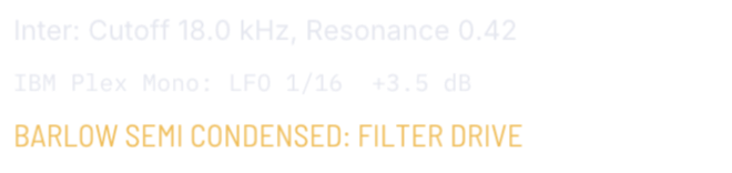
draw::loadUiFont · setDefaultUiFontAn app or plugin loads its own TTF or OTF from memory and draws with it on any backend; setDefaultUiFont swaps the house text face under every widget. The three lines below are Inter, IBM Plex Mono and Barlow Semi Condensed, loaded the way an app loads its own.
Icon catalogue
Material · Apache-2.0 / Lucide · ISCEvery embedded icon selector from snd/icons.h. Material glyphs work inline with ICON_MD_*; Lucide glyphs use ICON_LC_* with iconFontLucide(). Both faces are baked at twice their size, so a 16 px icon is sharp on a 2x display. Search by selector, display name, or codepoint.
snd::ui::Icon


snd::ui::paint geometry, icons come from third_party/fonts, and new retained surfaces draw through snd::ui::draw::Surface.
aGooey is the preferred retained path; Dear ImGui remains the compatibility layer for existing immediate-mode hosts.